from pathlib import Path

import numpy as np
import pandas as pd
import matplotlib.pyplot as plt
import seaborn as snsData visualization
![]()
Insurance Claim Analysis
The task at hand is to identify health and demographic characteristics that lead to poor health, using health insurance claim amounts as an indicator.
Data sources: - Kaggle - data.world
Config
# columns in the data
TARGET_COL = "claim"

# plots
%matplotlib inline
sns.set_theme(context="notebook", style="whitegrid", rc={"figure.figsize": (14, 8)})
Loading the data
# Google Drive link: https://drive.google.com/file/d/18zxQ8rwoinnWBTcDxhgP7pO_3QUSWcpZ/view?usp=sharing
df = pd.read_csv(
    "https://drive.google.com/uc?id=18zxQ8rwoinnWBTcDxhgP7pO_3QUSWcpZ",
    index_col="index"
)
df.info()
<class 'pandas.core.frame.DataFrame'>
Int64Index: 1340 entries, 0 to 1339
Data columns (total 10 columns):
# Column Non-Null Count Dtype
--- ------ -------------- -----
0 PatientID 1340 non-null int64
1 age 1335 non-null float64
2 gender 1340 non-null object
3 bmi 1340 non-null float64
4 bloodpressure 1340 non-null int64
5 diabetic 1340 non-null object
6 children 1340 non-null int64
7 smoker 1340 non-null object
8 region 1337 non-null object
9 claim 1340 non-null float64
dtypes: float64(3), int64(3), object(4)
memory usage: 115.2+ KBYData profiling report
import sys
!{sys.executable} -m pip install -q ydata-profiling
from ydata_profiling import ProfileReport
report = ProfileReport(df)
# uncomment the line below to see the report
# reportSeparate features from target
y = df[TARGET_COL]
X = df.drop(TARGET_COL, axis=1)

numeric_dtypes = ["int64", "float64"]
categorical_df = X.select_dtypes(exclude=numeric_dtypes)
numeric_df = X.select_dtypes(include=numeric_dtypes)
Distribution of variables
Target variable
fig, ax = plt.subplots()

sns.histplot(x=y, ax=ax, log_scale=True, kde=True)
ax.set_title(f"Distribution of {TARGET_COL}")
plt.show()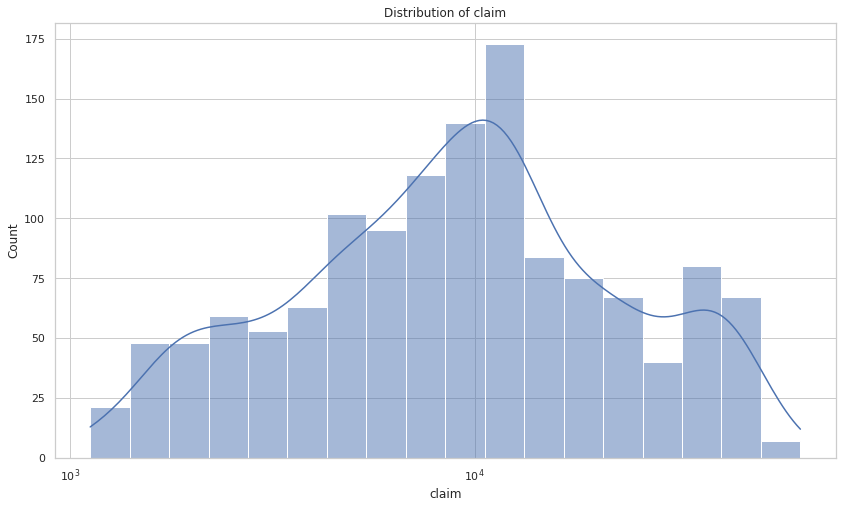
Numeric features
cols = 2
rows = np.ceil(numeric_df.shape[1] / cols).astype(int)
fig, axes = plt.subplots(rows, 2, figsize=(14, 8 // cols * rows))
plt.tight_layout()

for i, col in enumerate(numeric_df.columns):
    ax = axes[i // cols, i % cols]
    sns.histplot(data=df, x=col, ax=ax)
    ax.set_title(f"Histogram of {col}", y=0.88)

plt.show()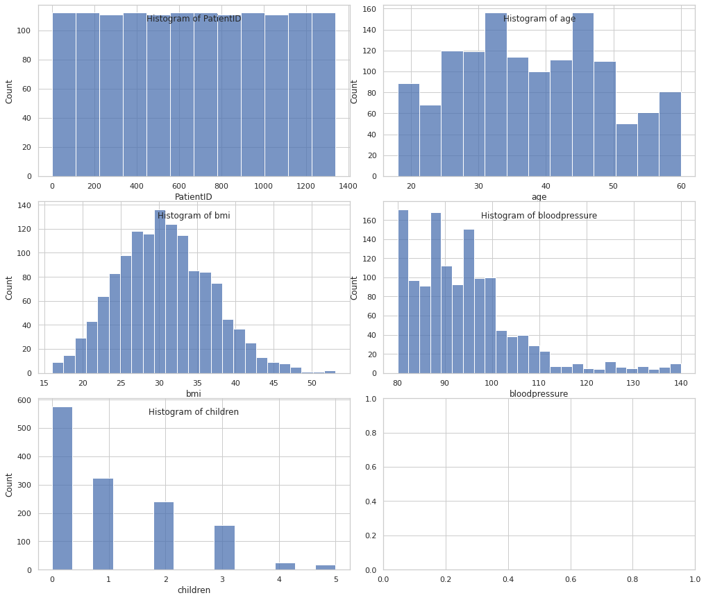
Numeric features by target
cols = 2
rows = np.ceil(numeric_df.shape[1] / cols).astype(int)
fig, axes = plt.subplots(rows, 2, figsize=(14, 8 // cols * rows))
plt.tight_layout()

for i, col in enumerate(numeric_df.columns):
    ax = axes[i // 2, i % 2]
    sns.scatterplot(data=df, x=col, y=TARGET_COL, ax=ax)
    ax.set_title(f"Scatter plot of {col} by {TARGET_COL}", y=0.88)

plt.show()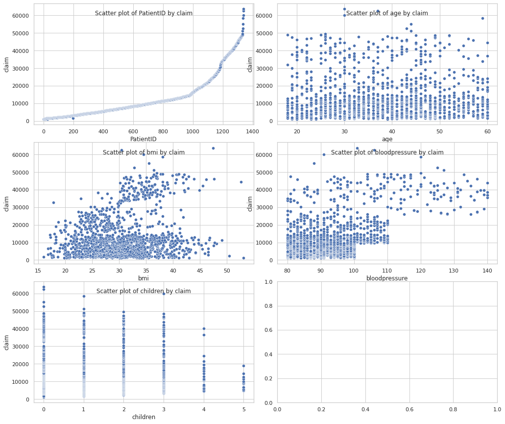
Categorical features
for col in categorical_df.columns:
display(X[col].value_counts(normalize=True).to_frame())| gender | |
|---|---|
| male | 0.50597 |
| female | 0.49403 |
| diabetic | |
|---|---|
| No | 0.520896 |
| Yes | 0.479104 |
| smoker | |
|---|---|
| No | 0.795522 |
| Yes | 0.204478 |
| region | |
|---|---|
| southeast | 0.331339 |
| northwest | 0.261032 |
| southwest | 0.234854 |
| northeast | 0.172775 |
cols = 2
rows = np.ceil(categorical_df.shape[1] / cols).astype(int)
fig, axes = plt.subplots(rows, 2, figsize=(14, 8 // cols * rows))
plt.tight_layout()

for i, col in enumerate(categorical_df.columns):
    ax = axes[i // 2, i % 2]
    sns.countplot(data=X, x=col, ax=ax)
    ax.set_title(f"Count of {col} classes", y=0.88)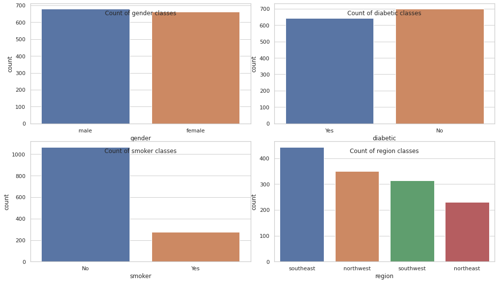
Categorical features by target
cols = 2
rows = np.ceil(categorical_df.shape[1] / cols).astype(int)
fig, axes = plt.subplots(rows, 2, figsize=(14, 8 // cols * rows))
plt.tight_layout()

for i, col in enumerate(categorical_df.columns):
    ax = axes[i // 2, i % 2]
    sns.stripplot(data=df, x=col, y=TARGET_COL, hue=col, ax=ax)
    ax.set_title(f"Scatter plot of {TARGET_COL} by {col}", y=0.88)

plt.show()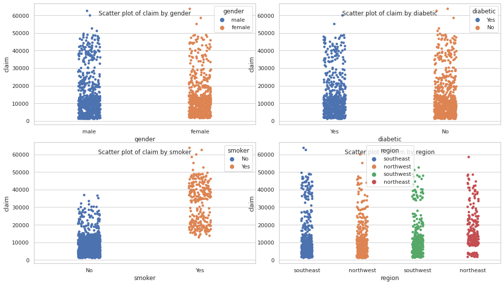
cols = 2
rows = np.ceil(categorical_df.shape[1] / cols).astype(int)
fig, axes = plt.subplots(rows, 2, figsize=(14, 8 // cols * rows))
plt.tight_layout()

for i, col in enumerate(categorical_df.columns):
    ax = axes[i // 2, i % 2]
    sns.boxplot(data=df, x=col, y=TARGET_COL, ax=ax)
    ax.set_title(f"Box plot of {TARGET_COL} by {col}", y=0.88)

plt.show()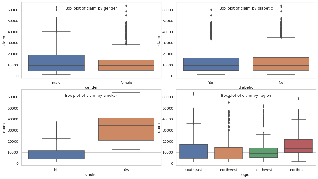
TODO
- Discretize blood pressure. Refer to https://www.heart.org/en/health-topics/high-blood-pressure/understanding-blood-pressure-readings
- Discretize BMI. Reference: https://www.cdc.gov/healthyweight/assessing/bmi/adult_bmi/index.html#InterpretedAdults